UX/UI Design06/2025 – 09/2025 · neuefische
Mina – UX/UI Case Study
UX/UI Bootcamp-Case bei neuefische — Research, Wireframes, Usability-Tests und Figma-Prototypen.
- Research → Wireframes → Tests → interaktive Prototypen
- Design System als Abschluss der Case
- Research → wireframes → tests → interactive prototypes
- Design system as the case deliverable
Case StudyCase study
11 Abschnittesections
Case StudyCase study
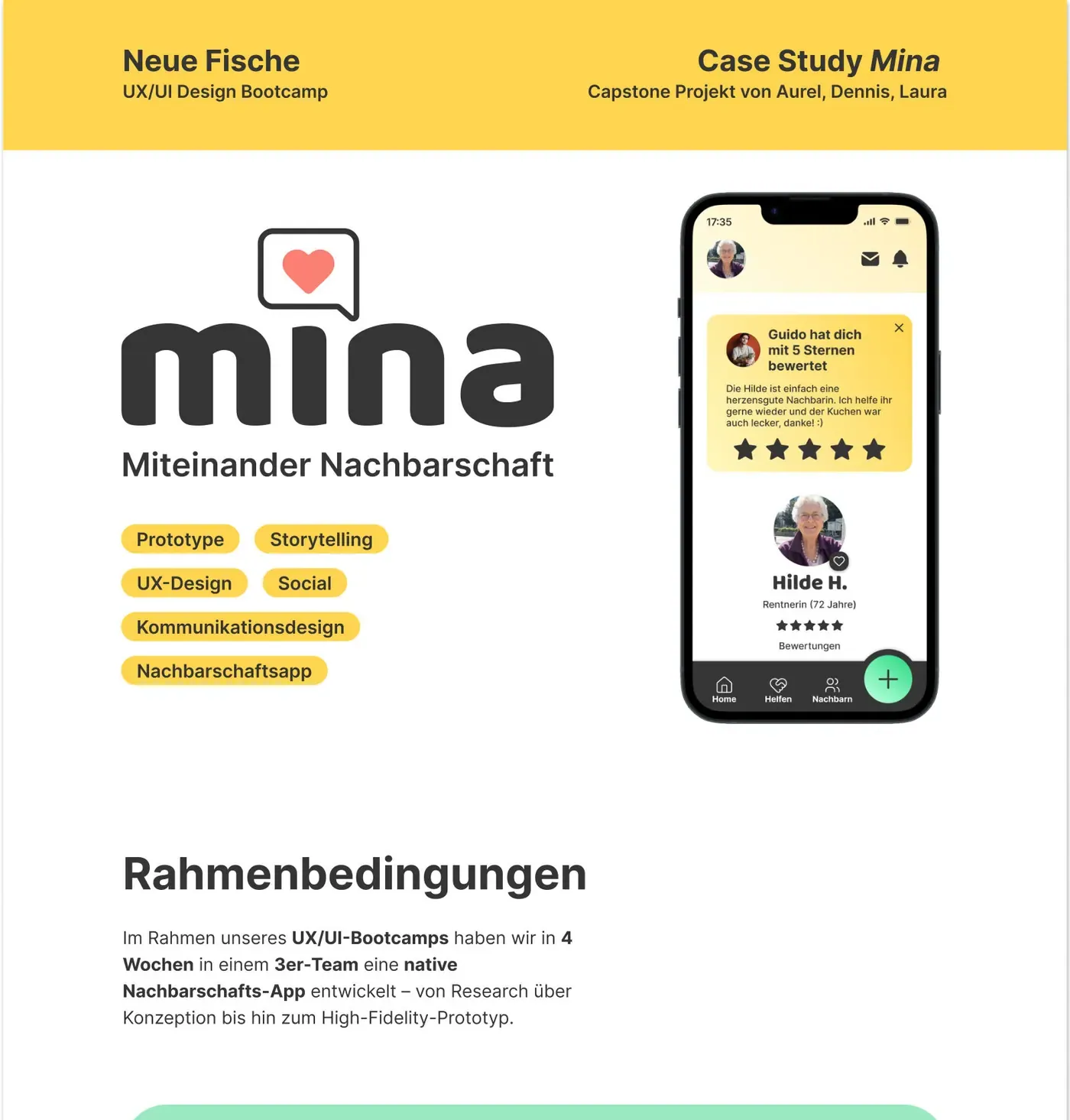
Mina — Miteinander Nachbarschaft
“Neighbourhood, together.” A native app that makes it easy to offer and accept help next door.
- Prototype
- Storytelling
- UX design
- Social
- Communication design
- Neighbourhood app
Framework
As the capstone of our UX/UI bootcamp we designed a native neighbourhood app in4 weeks, working as a team of three — from research and concept all the way to a high-fidelity prototype.
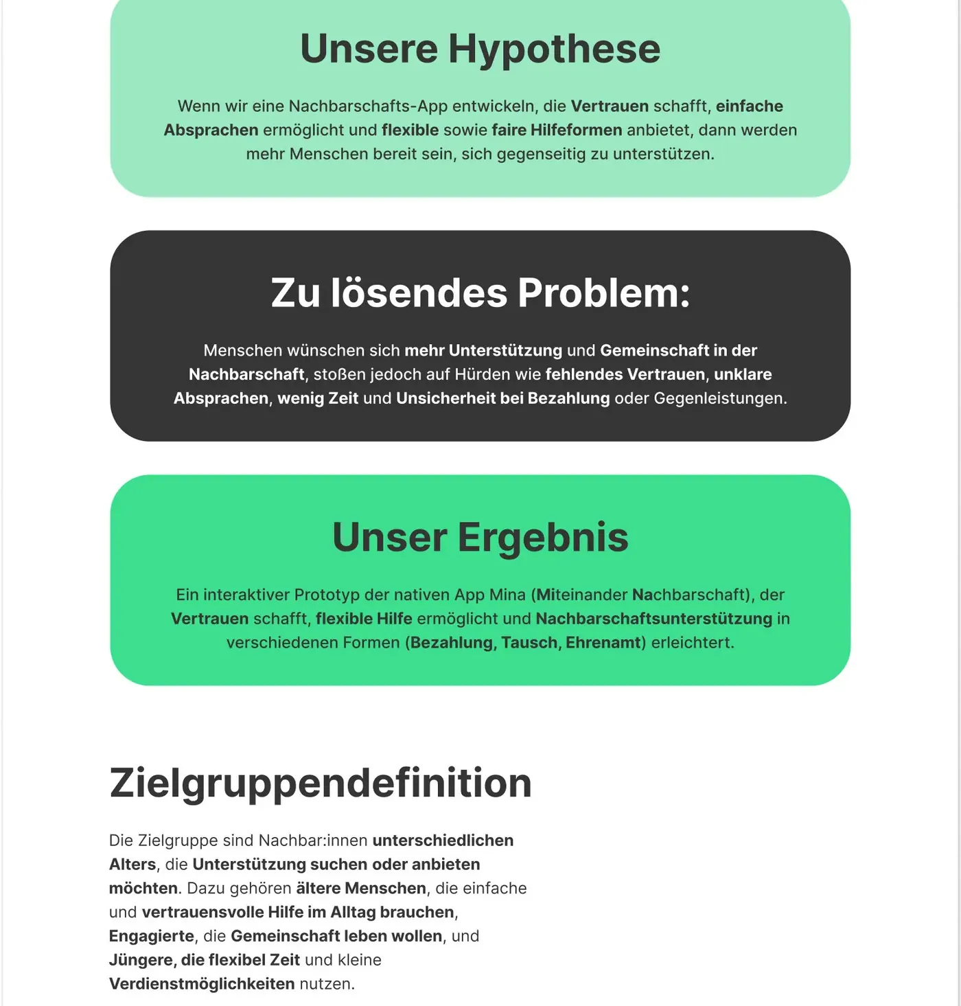
Our hypothesis
If we build a neighbourhood app that creates trust, enables simple agreements and offers flexible as well as fair forms of help, more people will be willing to support each other.
Everyone benefits from an uncomplicated, safe and connecting platform.
UX design
UX design in Mina means building an app that gives everyone something: the retiree findsreliable help fast, the student earns a little on the side, flexibly — and the engaged neighbour experiences real neighbourhood and community.
Painpoints
- Lack of trust & safety when contacting neighbours
- Unclear agreements on time, place and compensation
- Little flexibility — many can only help (or accept help) spontaneously
- Uncertainty around payment or exchange (when, how much, in what form)
- Social isolation, especially among older people who wish for more contact
Interviews & online surveys
Based on 8 interviews and 55 respondents in our online survey.
“Feeling safe matters a lot to me. Most of the time I simply trust my gut.”
Conclusion
Our research shows that trust is the central success factor — without verification and ratings, many would not use the app at all. At the same time there is a strong need for more community and neighbourhood contact, combined with a wish for flexible, spontaneous everyday help. Local mini-jobs, small favours and volunteering are especially attractive — and money is often not the point; togetherness is.
User personas & storytelling
Our three personas mirror the key motivations and hurdles. Hilde is at the centre — she is the focus of our clickflow. Together they show how Mina creates trust, makes help uncomplicated and keeps the neighbourhood alive.
Hilde Retired (72)
Motivation: Everyday help — groceries, small repairs, moving furniture. Trusted contacts, one simple solution.
Needs: Large type, plain language, simple navigation, verified helpers.
Painpoints: Distrust of strangers, fear of scams, overwhelmed by technology.
Guido Student (23)
Motivation: Earn money flexibly, take spontaneous jobs, meet new people.
Needs: Quick matching, clear compensation, low commitment.
Painpoints: Rigid schedules, unclear expectations.
Angela Employee (54)
Motivation: Wants to help, strengthen the community and build personal connections.
Needs: Safety and structure for her engagement.
Painpoints: No reliable framework for offering help.
How might we?
How might we build a neighbourhood app that first and foremost creates trust, strengthenssocial cohesion, enables time-flexible help — and at the same time leaves room for local earning, exchange and volunteering?
Design system
Our design system is the app’s central building block — it combines trustworthy colours, highly readable typography, soft radii and a friendly gamification layer into one consistent, inviting experience.
Consistency rules
Primary green for trust, supporting secondary colours, one type system and shared components.
Interaction patterns
Consistent feedback patterns, e.g. success messages and confirmation screens.
Accessibility
Contrast, readability and screen-reader compatibility from the start.
Tone of voice
Simple, informal address — reinforced through success messages and confirmations.
UI design
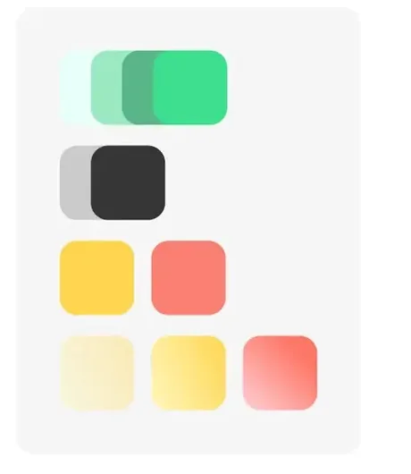
The UI builds on a harmonious palette of trustworthy green, fresh mint tones, warm salmon and friendly yellow, backed by neutrals. The three base colours mirror core needs and double as status colours — green for success, red for errors, yellow for “almost there”.Generous white space keeps things clear, while Lucide icons, 20 px corner radii and theBaloo typeface create a warm, approachable look. Baloo also carries our informal tone of voice, and Inter keeps body copy highly readable.

Naming & key visual
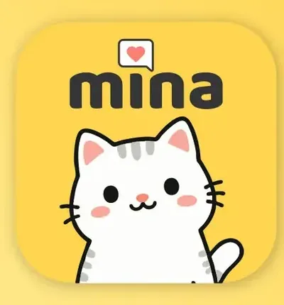
The name Mina is short for „Miteinander Nachbarschaft“ — roughly “neighbourhood, together”. It had to be short, memorable and instantly understandable in German-speaking countries, while feeling characterful and likeable — the cat association gives the app a friendly, approachable personality.
The cat appears on successes — a published help request, a written review — where shemotivates, gives positive feedback and warmly guides people through the app.
Gamification
Characters and neighbour titles make the app likeable and motivating: Hilde becomes the“Herzensnachbarin” — the heart-of-the-neighbourhood — because she mostly seeks help and stands for her warm nature.
Scenario
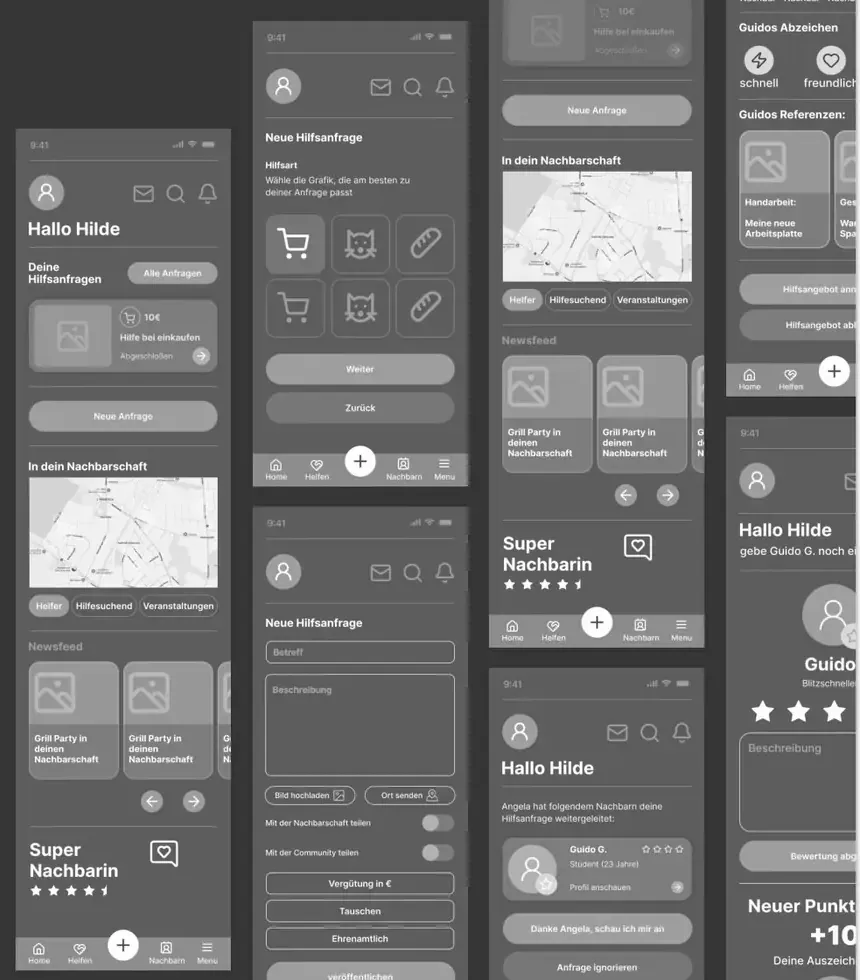
Hilde needs help, but Angela can’t always step in. With Mina, Hilde posts a help request for the first time — guided step by step — and gains confidence. Angela recommends Guido: Hilde gets support, Guido earns flexibly, and through Hilde’s review the chain of trust keeps growing.
User journey
Hilde experiences safety and self-efficacy because she is guided step by step despite her tech scepticism — which is exactly why her journey is central for clear click paths, trust and simplicity.
- 1Open the app
Needs to find her way quickly.
Painpoint: Low tech affinity
- 2Create a help request
Enters urgency, frequency and type of help.
Painpoint: Too many steps or unclear wording
- 3Wait for a reply
Painpoint: Uncertainty whether and when someone reacts
- 4Check the helper profile
Reviews the profile for trustworthiness.
Painpoint: Missing personal connection
- 5Build trust
Verification and ratings do the heavy lifting.
- 6Rate the helper
Job done — Hilde rates her helper.
Painpoint: Unsure how ratings work or why they matter
Clickflow
Using Hilde — the persona with the biggest trust painpoint — the clickflow shows how a help request can be created fast, simply and without hurdles.
- Open the app
- New help request
- Fill in the form
- Publish the request
- View notification
- View profile
- Verify profile
- Confirm the request
- Send a direct message
- Complete the request
- Write a review
- Publish the review
Together, not side by side
Mina is a neighbourhood app that strengthens trust and community by making it easy to offer or accept help — fast and flexibly, whether as volunteering, in exchange, or for a small payment.